As a designer, I consider the space in which you explore and develop your creative practices, whether is a closed or an opened space, it is very influential. Therefore I decided to promote the university and it's creative departments not through themselves but through all the diversity that is surrounding them. Greenwich in my opinion is a very diverse and multicultural location with amazing landscapes and well-known touristic objectives.
Taking that as a starting point and incorporating an idea that I initially had (creating a typeface for the final result) I started looking at Greenwich from my point of view and from a designer point of view (if you could say that) and broke it down into 4 characteristics which are the final piece in the end of this post.
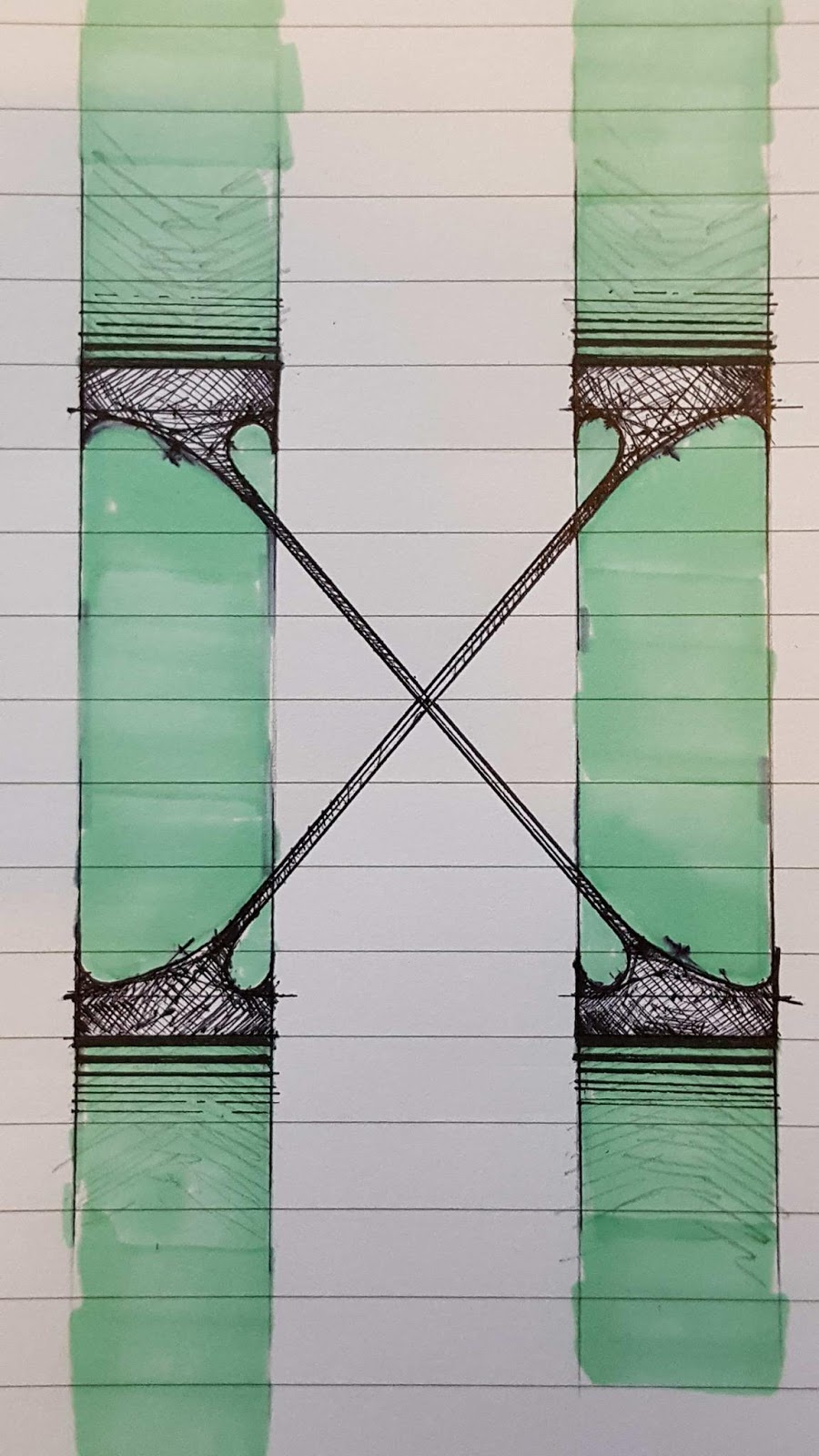
Inspired by the idea of "36 day's of type" I started doing my own but not by a set amount of time.
Sketchbook:


A big part of my digital lettering exploration:


Thinking of diversity I always wanted to do something pop art related (inspired by Andy Warhol poster of Marlyn Monroe)
One more thing that I think pushed me towards the Pop Art ideas was the fact that the footage that I used some so called "mass culture objects and characters" such as Peter Pan and Audio pick up. In the Pop art the use of "mass culture objects and characters" is a key ideology.
For the final thing I decided, instead of a full length video, to do 4 short loop gifs which in my opinion are more easy to "digest" and also leave space for interpretation which challenges the audience imagination.
V


Additional link:
Youtube video links:
https://www.youtube.com/watch?v=r2DREefdyeI
https://www.youtube.com/watch?v=PzqpY_Cn-kQ
https://www.youtube.com/watch?v=CE15SEXKsdc
https://www.youtube.com/watch?v=oPhWuuLbo5M
Google drive for the digital lettering files:
https://drive.google.com/open?id=0B1mdbt6UmSEkNkNPTkNCSkNXakU
Comments
Post a Comment