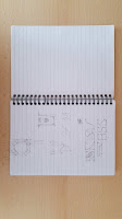
As a designer, I consider the space in which you explore and develop your creative practices, whether is a closed or an opened space, it is very influential. Therefore I decided to promote the university and it's creative departments not through themselves but through all the diversity that is surrounding them. Greenwich in my opinion is a very diverse and multicultural location with amazing landscapes and well-known touristic objectives. Taking that as a starting point and incorporating an idea that I initially had (creating a typeface for the final result) I started looking at Greenwich from my point of view and from a designer point of view (if you could say that) and broke it down into 4 characteristics which are the final piece in the end of this post. Inspired by the idea of "36 day's of type" I started doing my own but not by a set amount of time. Sketchbook: A big part of my digital lettering exploration: Thinking of diversity I...